Showing posts with label Distress Ink. Show all posts

Wednesday, November 28, 2012

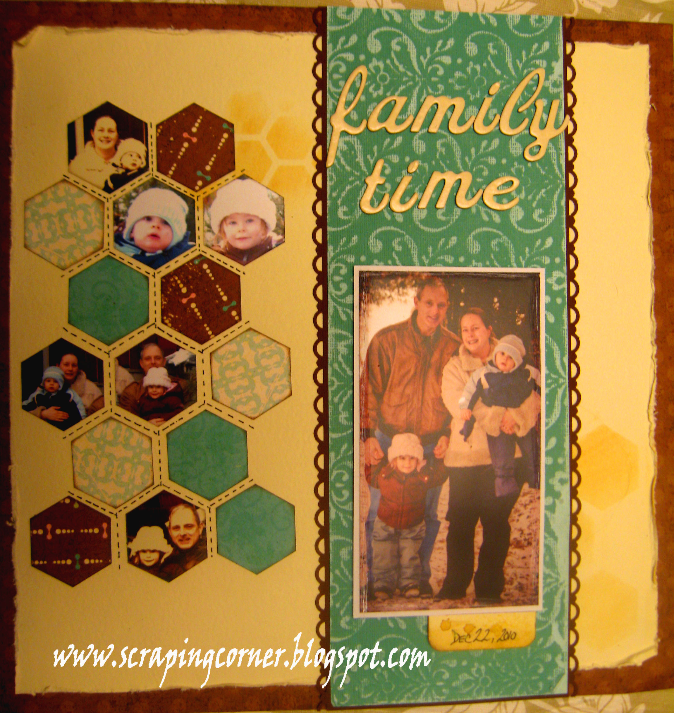
Family Time

The Echo Park collection Life Is Good is filled with fantastic colour combination of pinks and blues and browns.  I knew the other girls would be pulling the pinks out of this collection, and I wanted to use some winter photos so I pulled out the blue and brown from this collection.

Hexagons are very popular right now, and this sketch lended itself very well to using that instead of squares as was on the sketch.

 
The Theme this month was to use distressing on your layout, I did that in several formats, I distressed the edges of my paper with the Prima Comfort tool by roughing up the edges.  I also used the same tool's wire brush to distress the largest photo.  I used distress ink for the hexagon images in the background.  I used some Core'dinations paper and a sanding block in the center of the layout (blue). And finally I inked the edges of all the little hexagons and some WheatFields glimmer mist on the date.
I used several photos from the same day on this layout.  I apologize for the quality of these photos, as I had an unfortunately life changing event, my mother passed away on October 25th, luckily I was done my layout, however I left my husband in charge of taking some photos.  If you would like to see this layout in person it is on display at Auntie Em's.

I do hope you enjoyed this month's DT creations, it was fantastic to see how each of the girls took this sketch to a different level.  You too can play along for a fantastic prize simply by bringing your layout based on this sketch into Auntie Em's.  Remember that your materials for this project entry must have been bought at Auntie Em's to qualify.

Wednesday, November 7, 2012

I love your laugh


I've said it before and I'll say it again: I love Echo Park! I think their themes work really well with the type of scrapbooking that I do. This month the design team used the Life is Good collection. Usually, I have trouble using pinks when creating layouts featuring my little guy Sam. Not with this collection!
 
 
The November sketch of the PageMaps calendar was right up my alley. I use vertical bands all the time. That being said, the technique this month, aka distressing, is not my typical first choice. But I'm game to step out of my comfort zone from time to time!
 
The first distressing technique I used was Tim Holtz Distress Crackle Paint in clear. I used the crackle paint on the small squares and the vertical band.
 
 
Before putting the crackle paint on the vertical band, I used the flower chipboard pieces and sand paper to distress the paper. I also distressed the edges of the paper by using an edge distresser and using Distress Ink in Worn Lipstick.
 
 
The last distressing technique I used was to distress the edges of my photos by using a file.
 
 
In other non-distressing techniques: I spray the chipboard flowers and created my own small flowers using paper and a punch.


I said at the beginning of this blog post that I love Echo Park. Well, I love my kid and his laugh even more (obviously!). I took these pictures of Sam laughing in our backyard on a beautiful spring day. Now that the weather has taken a turn for the chilly, it's nice to be reminded how wonderful spring is and that it will be back...eventually!


Happy scrappin'!

Thursday, September 13, 2012

It Happens


I love PageMaps! Ever since my friend Natalie introduced me to the site, I've used their sketches as inspiration for my layouts. I really like the layouts from the 2012 PageMaps calendar...except for September's. Yeah, I'm saying it out loud: I did not like the September sketch. But I marched forward anyway and created this layout:


The collection used to create this layout is Hello Fall! by Little Yellow Bicycle, aka my favourite scrapbooking company. I used a die cut available with the collection and cut 2 more circles and placed them on the page slightly overlapped. I added the orange transparency on the right side of the page. Transparency pieces are usually available with every LYB collections. I love them because they aren't your typical embellishment.

I cropped my pictures and sanded the edges with a file.  I also create a journalling piece by using a piece of chipboard and covering it with yellow cardstock. The cardstock was a bit too yellow so I used Old Paper Distress Ink to tone it down. I added a piece of brown rickrack ribbon and some buttons.

 
The technique this month was to create our own title. I followed the instruction in the PageMaps calendar for the month of September. It was an easy technique and worked pretty well. I cheated a bit by using a transparency available with the collection.


I'm going to say something a little controversial: I don't really like my layout. Yeah, I said it. Maybe it was inevitable because I wasn't a fan of the sketch. I usually like everything I create because, as I've said many times, scrapbooking for me is about the memories. Art has very little to do with scrapbooking for me.

I used to be bothered when I created a layout that I wasn't pleased with. I've been guilty of redoing more than a few layouts because I didn't like the end result. Now, I see things a little differently. A while ago, I went to a crop and my friend AndrĂ©anne was there. Another friend made a comment that she didn't like her layout. AndrĂ©anne's reply: "It happens." I loved her nonchalant response! Really, she was right, it does happen. No big deal. You need to move on.

It was a great scrapbooking lesson to learn!

Happy scrappin'!


Wednesday, July 11, 2012

Double Trouble

I love the look of a well planned and balanced double page layout.  However most of the double page sketches that are out there have too many photos for my liking.  This months pagemap challenge had just two photos on it, which is great.  But I had three photos that I wanted to use. So... I stretched the sketch into a double page.  And using a technique that I saw on "Live With Prima" a few weeks ago, of building your double pages at the same time (can't believe I've never done that before) I thought I would give it a try.  Well I must say it came together very quickly and it does hold it's balance and continuity well.
I didn't put a title on my page (I may later) but I have dubbed it Cake Face.  These are photos of my son at his first birthday party and the next day when we were just hanging out at the local garage getting the oil changed in the car - he wanted to climb in those stacked tires so bad!


Using the Little Yellow Bicycle collection called Saturday's made it so easy to make a boy layout (or two) and the theme of this month's challenge is to use stamping on your layout to create your own embellishments.  I did just that with the previously naked chipboard circles and stars, and I also stamped and fussy cut (I know what were you thinking Lorena?!) a 'little yellow bicycle' .... psst it's actually a Prima stamp!  On some of the chipboard I did three layers of stamping - see the first photo where I did stamping and embossing on top of embossed background on top of a brick wall stamp.


You too can participate in this challenge, simply bring your layout based on the sketch to Auntie Em's scrapbooking by the end of the month and make sure you use stamping somewhere on your layout to enter!  There's going to be prizes!!!


Hope you enjoyed,


~Lorena~

Wednesday, June 13, 2012

Page Maps - June featuring Echo Park - This & That


Wow, I loved this collection from Echo Park - This & That. I'm not one to usually fawn over Echo Park, but they have really come a long way in the last two years from their infancy stages, very impressed I was with this collection. I loved the colour collection of the browns, yellows and teal green. I loved the boy theme to it, and all the wood grain!

So, this is me at Casino Rama in Orillia Ontario - my friend got tickets to see Sheryl Crow and we decided to 'make a donation' at the casino afterwards - great times! The arms raised in the air was from a commercial that Casino Rama was re-running over and over - I guess you had to see it to understand.


The theme to this month was sewing - I've employed 3 different types of stitching - I used my machine to stitch down the middle, I hand sewed in a blanket stitch the pocket and I did some faux stitching on the arrow and again across the middle. I layered some Prima flowers and coloured the naked chipboard arrow with the new Spring Distress ink in Peacock Feather - love that colour!! I had alot of story to tell with this layout, so I decided to tuck a journaling card into the pocket.

Would you like to be part of the Page Maps challenge?  You can enter your take on the calendar sketch at Auntie Em's - you don't have to use the Echo Park paper, you can use anything that you have purchased at Auntie Ems.

~Lorena~


Wednesday, March 14, 2012

A Boy's Life

The secret's out: I'm a keener! In early February, at our first design team meeting, Emma gave us all one project that had to be done by the end of the month. I was done the next day!

When the design team met again at the end of February, Emma asked me if I wanted to do an extra project for March and I enthusiastically said yes! I left the store that day with two extra projects: a product review (which will be coming in early April) and this one.

I have a 3-year old boy named Sam. So when Emma gave me the paper for this project, I was very happy! The collection is A Boy's Life by Echo Park. I have to say up front that Echo Park is one my favourite scrapbooking companies. Their lines are perfect for scrapbookers who want to create layouts featuring their children.

I managed to make two layouts with the 5 papers I had from the line.

My Friend Caleb


This layout showcases pictures I took in December 2010 of Sam and his friend Caleb playing together. I used several techniques on this layout, including using the Sea Easy to add the faux stitching detail at the top and bottom of the page; using a border punch and Distress Ink in Broken China; using another border punch to add a horizontal border at the bottom on the page; using pop-up tape to add dimension; and sanding the edges of my main photo. You can see a close-up of these techniques below:

One of the things I love about the Echo Park collections are the accompanying sticker sheets. Usually, you get one alphabet sticker sheet and one with designs. I used both in this layout.

Alphabet sticker sheet:

I used a few border pieces from the other sticker sheet.

Nothing says that you have to use the stickers "as is". As shown in one of the pictures above, I took the orange zig zag border piece and cut it to use it as a mini-border on the side of two pictures. One of my complaints about stickers (of the non-chipboard variety at least) is that they lack dimension. To fix this, I used pop-up tape on some of the stickers. It allowed me to layer stickers, like I could have done with flowers:


Fun with Alfie

The second layout I created with this collection is one featuring Sam and our cat Alfie.

I used similar techniques to the last layout, but a few different ones, including: sanding the edges of the pictures; using stickers and using pop-up tape for some of them; ripping the edge of one of the papers and inking that edge; and using a border punch to create a border:

Notice that I used different alphabet stickers on this layout. With this collection, there were 3 different sets.

The technique that really worked out but doesn't show through on the pictures is the crackle paint on the die cut used to mat the journalling box (by the way, the journalling box was on the sticker sheet). I used Tim Holtz Distress Crackle Paint. I then used Distress Ink in Broken China and rubbed the ink on top of the crackle.


I'm so happy with these pages! It just goes to show that the combination of techniques and stickers can work well together.

Happy scrappin'!

Thursday, March 31, 2011

April showers bring ...

May flowers?  Well in this case they bring a brand new product line from My Mind's Eye; Stella & Rose!

What a wonderful collection that the Design Team got to work with this month for the Scrapbook & Cards Today/Page Maps Challenge.

  
Melissa went with a pallet rich in reds and enhanced the patterns of these papers while making her photo the central theme to this layout.  She never ceases to amaze me - she printed this photo on textured cardstock to give an allusion of canvas - ingenious!  She pulled out all the green stops with this layout, from painting the paper, to glimmer mist, to inking the chipboard letters; using Distress Ink in Peeled Paint, Making Memories paint in Meadow and Glimmer Mist in Olive Green. Her trim is from Tim Holtz rubbed down with more Distress Ink this time in Victorian Velvet, topped with a strip of Heidi Swapp bling.  The chipboard letters are Basic Grey and the brads are from the My Mind's Eye Stella & Rose collection. 


For my layout I used the same paper (that's right we had the SAME paper for this one, not just the same collection) I opted to use a stitched edge on the left and focus in more on the green and blue hues of this line.  I too used Basic Grey letters for my title.  The flowers are handmade (of course) and if you like what you see there you may be interested in attending the first every L&L flower making techniques class - just in time for spring (April 13th)  I too used Glimmer mist and Distress Inks, but I used Electric Blue and Broken China on a Glimmer chip dove, and many of the My Mind's Eye Stella & Rose collection brads.


Two very different layouts, two different styles, two different designers.  Let us know what you think of these works of art! 

Remember that all My Mind's Eye is on sale at the store for the entire month of April!

Lets see what you come up with, email your creations to EmsCreativeCorner@gmail.com and we will post them to the Fan Page on Facebook!

Thanks for looking and don't forget to become a follower and post your comments!

~Lorena~