Showing posts with label Sarah. Show all posts

Saturday, February 2, 2013

Challenging!

At Auntie Em's Scrapbooking we are all about the challenge.  So when Emma asked me to put together as many projects as I could out of 8 sheets of patterned paper I was all for the challenge.  What's even more challenging is the fact that she gave Sara (fellow Design Team member) 8 sheets of patterned paper too! *rubbing hands together* I love it!

I received the Prima line En Francais - filled with cool grey/blue, rusty brown and taupe ... very boy, but very French as well, and well ... I don't have anything French about me, unless you count the mean French toast that I make periodically on a Sunday for my family LOL!

I also have entered this into the Prima Marketing - Build-A-Page contest, each month they supply a sketch and you build a layout using Prima product based on, or inspired by the sketch.  Email it off to Prima and wait to see if you are featured on their blog or better yet, win a prize package!  I did this last month as well, and was featured on their blog!!

So ... here we go!  The sketch was this:Prima's BAP January 2013


And here is my entry!!


So, tell me what do you think?


Saturday, December 1, 2012

December Design Team reveal

This is your final installment of your Auntie Em's Design Team layouts for the year 2012!

This month we all got to play with the Holly Jolly collection from Echo Park, full of bright blues, pinks combined with traditional reds and greens.  Plenty of selection for every type of scrapbooker!  The theme this months is Ribbons and Bows - use them on your layout but make sure to leave some for the gifts under your tree!

Here is what the girls came up with:


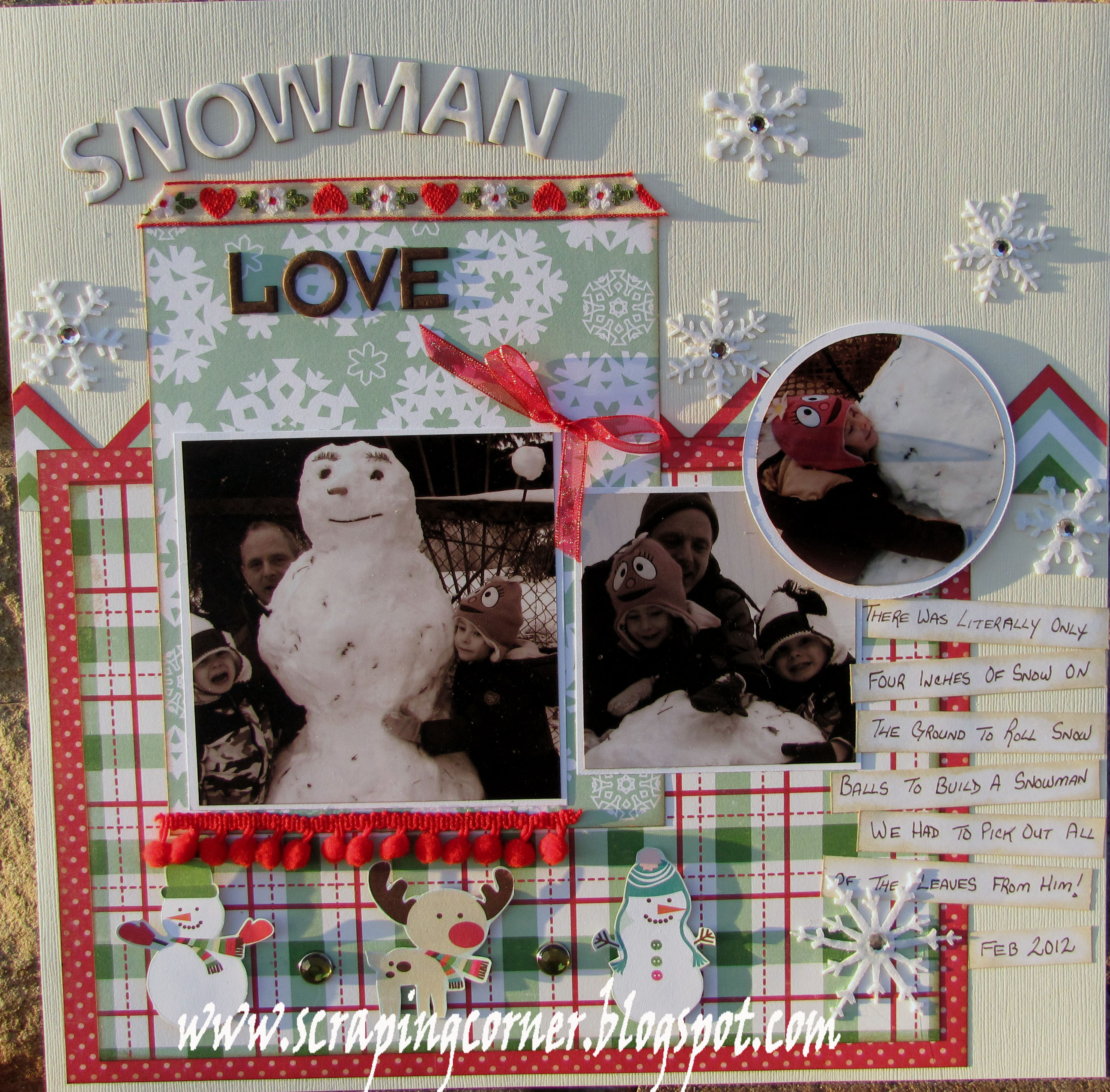
Lorena's Take:  "Snowman Love"

Nancy's Take:

 
Stephanie's Take: Ho Ho (Ho)


Sarah's Take:


You too can play along with this sketch challenge.  Use the Scrapbook & Cards Today sketch calendar and products you have purchased at Auntie Em's to come up with a layout featuring ribbons or bows and bring it into Auntie Em's for a chance to win a fantastic prize!

Stay tuned for next month when we will be announcing some new changes to the Auntie Em's design team.

Wednesday, November 7, 2012

I love your laugh


I've said it before and I'll say it again: I love Echo Park! I think their themes work really well with the type of scrapbooking that I do. This month the design team used the Life is Good collection. Usually, I have trouble using pinks when creating layouts featuring my little guy Sam. Not with this collection!
 
 
The November sketch of the PageMaps calendar was right up my alley. I use vertical bands all the time. That being said, the technique this month, aka distressing, is not my typical first choice. But I'm game to step out of my comfort zone from time to time!
 
The first distressing technique I used was Tim Holtz Distress Crackle Paint in clear. I used the crackle paint on the small squares and the vertical band.
 
 
Before putting the crackle paint on the vertical band, I used the flower chipboard pieces and sand paper to distress the paper. I also distressed the edges of the paper by using an edge distresser and using Distress Ink in Worn Lipstick.
 
 
The last distressing technique I used was to distress the edges of my photos by using a file.
 
 
In other non-distressing techniques: I spray the chipboard flowers and created my own small flowers using paper and a punch.


I said at the beginning of this blog post that I love Echo Park. Well, I love my kid and his laugh even more (obviously!). I took these pictures of Sam laughing in our backyard on a beautiful spring day. Now that the weather has taken a turn for the chilly, it's nice to be reminded how wonderful spring is and that it will be back...eventually!


Happy scrappin'!

Friday, November 2, 2012

Life is Good - Your Design Team's November Sketch Challenge

The cool weather is now upon us, so it's a great time to get some crafting done! This month, your Auntie Em's design team used the Life is Good collection by Echo Park and our layouts feature distressing techniques.

Lorena's take:


Nancy's take:
I

For the distressing I pulled out a few pages from a notebook that had a nice little bicycle image in the corner. I crinkled it and sprayed some glimmer mist on it and worked it in to give the paper an antique feel I did this twice wetting the paper as well to make it really wrinkled and blow dried it. Layered 2 of those and voila my page was complete.


Sarah's take:


I used clear Tim Holtz Distress Crackle Paint on all the pattern papers. I distressed the brown vertical band by using the chipboard flowers and sand paper and by distressing the edges. I also distressed the edges of my photos by using a file.

Stephanie's take:


I used brown VersaMark ink on my pattern circles and photo mat, and used a photo from Instagram that had a distressed grainy look to it.  


You too can submit your PageMaps calendar November layout for a chance to win a prize from Auntie Em's Scrapbooking. All you need to do is create a layout based on the sketch using distressing techniques with product purchased from Auntie Em's.  So, bring your layout into the store!

Monday, October 1, 2012

Your October Page Maps sketch challenge

Look what your Auntie Em's design team has put together with the Bo Bunny Whoo-ligans collection!  Based on the October sketch from the Pagemaps calendar.  Your challenge is to create a POCKET!

Lets see how each DT member has integrated a pocket into their layout.

Lorena's Take(s):


Stephanie's Take:
I struggled with my layout this month.  I wasn't thinking outside the box, I had a hard time figuring out how to use the stickers, how to create a pocket and I had no Halloween pictures. 


Sarah's Take:


I had already scrapbooked all my Halloween pictures from last year so I decided to use pictures of my little guy dressing up as Green Latern. I made a pocket with faux-stitching and used it to hide my journalling.

Nancy's Take:
I guess the October layout challenge inspired me more then usual and I was able to create a double page spread. Our challenge was to make a pocket. I actually started out by printing the burger pic of gaby and cutting it out. I was playing with the cutout and making her peek a boo out of the pocket and that's where the title came from.


You can play along for a chance to win a FANTASTIC prize from Auntie Em's Scrapbooking, all you need to do is create a layout based on the sketch utilizing a pocket with product purchased from Auntie Em's.  Simply bring your layout into the store for viewing.

You will NOT be disappointed with the prize that is available to be won!


Thursday, September 13, 2012

It Happens


I love PageMaps! Ever since my friend Natalie introduced me to the site, I've used their sketches as inspiration for my layouts. I really like the layouts from the 2012 PageMaps calendar...except for September's. Yeah, I'm saying it out loud: I did not like the September sketch. But I marched forward anyway and created this layout:


The collection used to create this layout is Hello Fall! by Little Yellow Bicycle, aka my favourite scrapbooking company. I used a die cut available with the collection and cut 2 more circles and placed them on the page slightly overlapped. I added the orange transparency on the right side of the page. Transparency pieces are usually available with every LYB collections. I love them because they aren't your typical embellishment.

I cropped my pictures and sanded the edges with a file.  I also create a journalling piece by using a piece of chipboard and covering it with yellow cardstock. The cardstock was a bit too yellow so I used Old Paper Distress Ink to tone it down. I added a piece of brown rickrack ribbon and some buttons.

 
The technique this month was to create our own title. I followed the instruction in the PageMaps calendar for the month of September. It was an easy technique and worked pretty well. I cheated a bit by using a transparency available with the collection.


I'm going to say something a little controversial: I don't really like my layout. Yeah, I said it. Maybe it was inevitable because I wasn't a fan of the sketch. I usually like everything I create because, as I've said many times, scrapbooking for me is about the memories. Art has very little to do with scrapbooking for me.

I used to be bothered when I created a layout that I wasn't pleased with. I've been guilty of redoing more than a few layouts because I didn't like the end result. Now, I see things a little differently. A while ago, I went to a crop and my friend Andréanne was there. Another friend made a comment that she didn't like her layout. Andréanne's reply: "It happens." I loved her nonchalant response! Really, she was right, it does happen. No big deal. You need to move on.

It was a great scrapbooking lesson to learn!

Happy scrappin'!


Saturday, September 1, 2012

Why, Hello Fall!

That's right it's Fall .... well almost.  The kids are back in school, the air is crisp and your Auntie Em's Design Team has been hard at work with the Hello Fall collection from Little Yellow bicycle.  The theme this month is to make your own title for your layout.  Using the PageMaps calendar the girls have come up with these various takes:

Lorena's Take: "We Love The Fall"


Sarah's Take: What Autumn?


I made my own title by following the instructions in the PageMaps calendar. It was really easy and I was happy with the results!

Stephanie's Take: 


I'm not very good at drawing, and I have terrible hand writing, so I decided to use button to create half of my title, the other half, I cheated and used my Cricut.  

Nancy's Take: 


What a perfect opportunity to create a thanksgiving page with such beautiful fall paper. I loved the sketch cause it used a bunch of images and allowed me to get lots of pictures into just one page.

I decided to get fancy with making my own title and used some chipboard letters I already had and traces them on raw chipboard and cut them out then I roughed up the edges drew some stitching and inked them as well. Love love love the result.


Remember you can play along too, there are fantastic prizes up for grabs each and every month at Auntie Em's when you bring in your layout inspired by the PageMaps sketch - this month be sure to make your own Title!

Let us know what you think!

Wednesday, August 15, 2012

Mother's Day

On Mother's Day 2012, I asked my husband Matt to take pictures of my son Sam, my mom and I together. Like most men, Matt doesn't think of these things on his own. I have to ask. Regardless, he managed to get a few decent pictures to remember the day.

This month, the design team used the Songbird collection from Prima. Let's face it, Prima products are BEAUTIFUL! I thought this soft and pretty paper was perfect for my pictures.


Our challenge this month was to create flags or pennants. Flags and pennants are very popular these days and are easy to make. For my layout, I made flags using scrap pieces of paper, a square punch and toothpicks.


I used a journalling box that came with the collection and added embellishments: Prima wood buttons, chipboard sticker and butterfly. The butterfly came in a stark white, which really didn't go with my layout. I used Glimmer Mist to change the colour.


Check out the Songbird collection at Auntie Em's and don't forget to submit your layout for this month's challenge.


Happy scrappin'!


Wednesday, August 1, 2012

August PageMaps Challenge - Songbird style

Have you noticed how flags and pendants are popping up everywhere in scrapbooking?  This month the PageMaps challenge is to create a Flag or Pendant on your layout based on the August PageMaps sketch from the Scrapbook & Cards Today calendar. 
Check out what your Auntie Em's Design Team did using the Songbird collection from Prima Marketing.

If you want to play along for an amazing Auntie Em's prize - simply bring your layout to Auntie Em's before the end of August.

Stephanie's Take: Pretty Girl


I kept it pretty simple this month, letting the photos of my niece be the main focus of this page.  I didn't want embellishments to take over, a simple title, wooden buttons, and my version of a flag was just enough.

Sarah's Take: Mother's Day


Flags are easy and fun to make. I cut a few strips of paper and used a square punch on the end. Then, using liquid glue, I wrapped the other end around a toothpick. I love that an embellishment that took 5 minutes to make can add so much to a layout.


Nancy's Take: Too Cute

When I saw the paper I knew right away what photos I wanted to use. I love it when it's obvious what the page will become. I used the flag in the title and I had a leftover pin from one of the last challenges that went just perfectly on the layout. I simply wrote TOO in brown pen and drew some stitching around it wrapped it around the pin and voila "too cute"

Lorena's Take: "SMORE'S"

I turned the sketch on it's side and created a unique title with the ticket shaped alphabets with this collection.  I used both colour and sepia photos together on this layout to capture the moment of my daughter's Smore's experience - pure love!

Watch this blog every week for more close up's and details about each layout.  You can see each of these layouts displayed at Auntie Em's for the entire month of August.


Sunday, July 1, 2012

July PageMaps Challenge - Your Design Team - Stamping

July is upon us and your Auntie Em's Design Team has been put to the challenge of using the July PageMaps sketch and using stamps to make your own embeslishments.  Featuring the Little Yellow Bicycle collection "Saturdays".  Here is what your design team girls have come up with!

Sarah's take:


I like to use stamps to as accents. On this layout, I used a stamp to create the 'Love' title. I stamped on a scrap piece from the Saturday collection and then used scissors to create my very own personalized die cut. I also stamped on chipboard that I first covered with Glimmer Mist. Finally, I stamped the words 'Consider yourself hugged' on the bottom of the journaling box.


Lorena's Take:

I decided to switch it up this month and convert the one page layout into a double! I used various stamps to add layers to my chipboard pieces including several Prima Marketing stamps and My Mind's Eye .  Infact my "little yellow bicyle" is a Prima stamp too!  Although I have not put a title on this layout, I've been calling it "Cake Face" if you read the journaling - you will see why! 

Stephanie's Take:


For this challenge I decide to stamp on the chipboard stars.  I don't like stamping directly on my pages because I usually end up messing it up.   Although the stars don't look like I had imagined they would, they actually turned out better.  For Instagram users out there, the photos were printed after being processed with Instagram and a little editing with Photoshop, because the photos are square, online printing wants to make them 4x6. Check out my individual post in the next couple of weeks for a full description.

Nancy's Take:
This months challenge was fun and easy the thing I love about stamps is that you can use them in so many different ways it's incredible. Oddly enough my july layout is all about the snow village but eh there are no rules as to when you have to create your pages as long as they get done :)

YOU can participate in this challenge too by bringing your layout based on this sketch to Auntie Em's Scrapbooking before the end of July.  Make sure to use stamps somewhere on your layout to qualify! There's going to be prizes!

Wednesday, June 6, 2012

Swoosh

This month's design team challenged was to use stitching on a layout. My reply: YAY! I love to use faux-stitching and/or hand stitching on layouts. For more information about stitching and products, you can check my product review from April 2012.

Here is a picture of the layout I submitted for this month's challenge:


The paper line used is This & That Charming by Echo Park. It's no secret: I love Echo Park paper! I have a 3-year old, so their more juvenile themes are right up my alley. This layout features my little guy playing with his new basketball set in our newly finished basement.

I started off with a piece of cardstock and layered two different pattern papers from the collection, leaving about 3.5 inches of the cardstock showing at the bottom. At the seam of the two pattern papers, I used a piece of green rickrack ribbon. I added the velvet brown brads and the end of each side of the ribbon. I love these velvet covered brads!

I then used a third pattern paper to create a mat for my pictures. On the right side, I used a border punch to add detail. On the left side, I use the Sew Easy to create two lines that crisscross. I then hand stitched using brown floss from We R Memory Keepers. I slightly layered my pictures on top of each other and added the cute clothespins at the top of each one.


Next, I created a journalling box using one of the die cuts from the line. I also added a chipboard piece that I painted with Glimmer Glam. Glimmer Glam by Tattered Angels is one of my favourite products to use on chipboard.


I added another die cut from the line as another embellishment. I added the Tim Holtz pins, which I love because it's so hard to find embellishments that are more boyish.


Last but not least, I added the buttons at the bottom left of the page and the title at the top right. For the title, I used Basic Grey chipboard letter and I traced them using a brown pen. I again painted the chipboard brackets with Glimmer Glam.


As I said at the beginning of this post, I love Echo Park! I'm so happy that they continue to come out with great lines that I can use to scrapbook my little man. Check out the This & That Charming line at Auntie Em's!


Happy scrappin'!


Sunday, June 3, 2012

Swoon

I love weddings! They are happy events filled with hope and love. There is something awe-inspirering about watching two people stand up in front of their family and friends and promise to love each other for the rest of their lives.

Last summer, I attended the wedding of my friends Glynis and Simon. This wedding was a long time in the making! The pair met in high school but didn't start dating until later on. I myself have known Simon for almost 25 years and Glynis for almost 18 years. It was a privilege to be invited and be a witness to this very happy day.

I had a few pictures to scrapbook from that day and when I saw the Swoon collection from Little Yellow Bicycle at Auntie Em's Scrapbooking and Beading, I thought it was perfect. This collection is absolutely stunning! Every single paper sheet is gorgeous and the embellishments are to die for! Because it's so neutral, it doesn't matter what the wedding colours were. The line goes with any colour in my opinion.

I'd like to share two layouts that I made of Glynis and Simon's wedding with the Swoon collection. 

The first page features the bride and groom walking down the aisle minutes after being pronounced husband and wife. The happy couple was all smiles and I managed to snap this picture myself from my seat in the church as they walked by.  


As a backdrop, I used the 'Always' paper, which has foil accents. My picture does not do this paper justice. It's simply beautiful! Because the foil accents were so beautiful, I didn't want to cover them up with multiple pictures. To me, this paper was meant to be used for a single picture layout.

I started by matting my pictures with the 'Black Tie Stripe' paper. I then placed it on the 'Always' paper as to not cover up the foil accents. I added a doily, the chipboard piece and the paper flower (that are available additions to the collection) to the top-left corner of the matted picture.


Next I added the horizontal border at the bottom of the picture. I layered silver ribbon, a Swoon chipboard piece and a string of pearls.


I then clustered paper flowers, chipboard pieces, stickers (all available with the collection) and pins on the bottom-right of the picture.


At the bottom-right of the 'Always' paper, there's a little foil accented box that I thought was perfect to write the date of the wedding using a silver pen. I also used bling (also available with the collection) to accent the 'Love'.

I went in a different direction for the second page I made with the Swoon collection. I wanted to create and layout using many pictures - in this case, six.


At the top of the paper, there are the words 'Wedding March'. I wanted to play this up so I added bling on each end.


The key to creating a layout with numerous pictures is to crop your pictures as much as possible. I selected pictures that were cropable (not a word, I know, but I'm taking creative license). After my pictures were glued in a kind of a grid, I added a ribbon with large white flowers as a horizontal border at the bottom. Believe it or not, the ribbon is from the Winter Joy collection by Bo Bunny from a few seasons ago. It just goes to show that you should aways go through your stash to see what you have!

Looking at the white space underneath the ribbon, it felt it was a little naked so I added the title 'Love' using the chipboard pieces available with the Swoon collection.


I then used a doily again and clustered paper flowers, chipboard pieces and a sticker on the top-right of the page.


After I was done that, I felt like the page was still missing something. So, I added a small string of pearls as a border between two pictures and capped it off with a chipboard butterfly. I added a few pieces of bling to the butterfly to make it stand out more. 


I hope you are now inspired to create your own wedding layouts, whether they be from pictures of your own wedding or the wedding of friends or family. Weddings are such important events. They deserve to be scrapbooked. Having collections like Swoon to work with doesn't hurt either!

Check out the Swoon collection at Auntie Em's.


Happy scrappin'!